Today is a day I have been waiting for for almost four years. The reveal of our master bathroom makeover! If you're just catching up, this is the final reveal week for the Spring 2017 One Room Challenge hosted by Calling It Home. In week one I shared our dated, tiny master bathroom. It's been in desperate need of an overhaul since the day we moved in, but since we're the only ones who see it regularly, it sat at the bottom of our to do list for years. We finally decided to tackle it, and I am so glad we did! It's certainly still a tiny bathroom, but it feels so much bigger and brighter with just a few small and affordable updates. I'm so excited to share it with you!
This post is sponsored by M-D Building Products. As always, I only recommend brands I love and think you'll love too!
This post may also contain affiliate links for your convenience. For more information, see my disclosure policy.
Just to refresh your memory before we check out the makeover, let's take a look at how awful it used to be!
Yuck! That shower was beyond gross. The grout was crumbling away and starting to mold in some spots. The shower door had so much soap scum on it, it was impossible to renew. I won't even mention those ivy tiles. Ugh.
The walls were green. The countertop extended over the toilet making the room feel even smaller and more enclosed. The floor grout was peach color. Anddddd more ivy tiles!!!!
We both really hated this space, but we were also dreading renovating it. We assumed that a bathroom overhaul would be really expensive and difficult. However, this whole project cost less than $2000, and that's with a few splurges we could have done without. It was also a lot easier than we anticipated. Sure we hit a few snags along the way, but for the most part, we learned that having the right tools makes projects like this go so much smoother!
Alright, enough chit chat. Take a peek at my original design board if you'd like, and then let's check out what it looks like now!

This post may also contain affiliate links for your convenience. For more information, see my disclosure policy.
Before:
Just to refresh your memory before we check out the makeover, let's take a look at how awful it used to be!
The walls were green. The countertop extended over the toilet making the room feel even smaller and more enclosed. The floor grout was peach color. Anddddd more ivy tiles!!!!
We both really hated this space, but we were also dreading renovating it. We assumed that a bathroom overhaul would be really expensive and difficult. However, this whole project cost less than $2000, and that's with a few splurges we could have done without. It was also a lot easier than we anticipated. Sure we hit a few snags along the way, but for the most part, we learned that having the right tools makes projects like this go so much smoother!
Alright, enough chit chat. Take a peek at my original design board if you'd like, and then let's check out what it looks like now!
Affordable bathroom makeover:
Reminder, this bathroom is super small with no natural light, so it's pretty tough to photograph. However, I somehow managed to do some pregnancy acrobatics to get enough shots for you to get the idea! 😂 Just bear with me for any funkiness going on! 😘
Okay, here's the from our master bedroom through the bathroom doorway. See! So much lighter and brighter!
Our main goal was to be able to leave the floors intact. We weren't a huge fan of them, but there was nothing terribly wrong with them, so we chose a neutral color palate to match the browns and beiges in the tile and to tone down the peach. We lightened up the walls a ton using a light beige paint (Sherwin Williams "Natural Choice") on the top section and adding white beadboard at the bottom (Sherwin Williams "Alabaster"). We chose taupe accessories to bring out some of the darker colors in the tile.
The biggest change of course was the shower. We removed the old ugly ivy tiles and the gross old cement backer board. We waterproofed the shower using a backer board called PROVA Board Plus+. I'm thrilled to not have to worry about any more future mold or water damage issues. Our shower pan was in pretty good shape, so we left that in place and just replaced the old plastic drain piece with a chrome one. Then we used some awesome tiling tools from MD Building Products to install cream colored subway tiles and taupe colored sanded grout. (For those who have asked me about the PROVA board, I'll be sharing tons more info along with an installation tutorial for that and the tile next week!!!)
We opted not to have a shower door anymore because I am so over trying to clean that thing! An extra perk of no door is that the shower and bathroom look a lot bigger without it! We also took the tile all the way to the ceiling which also gives the illusion of more space. And I just can't get over how much better the tile looks now! 😍
My next favorite thing we did is ditch the old vanity. We had planned on keeping it and painting it. We were going to replace the countertop to remove the part over the toilet. As we started pricing things out, we realized for the price of just a countertop and the amount of work we would have to do, it was so worth just buying a new vanity that we actually love. The lack of countertop over the toilet definitely makes a HUGE difference in the space!!!
And the vanity 😍 It has a rustic wood finish with a cream marble top that matches the floor tiles surprisingly well. It also has more storage space even though it's actually a lot smaller! I love having that bottom drawer! The depth of this vanity is a lot less than the one we had before, which also helps the space feel larger.
Since the mirror was a built in medicine cabinet, we decided to avoid the mess of trying to remove it and fill it in. We simply painted the wooden frame. It looks so much more modern now with just a bit of paint!
We chose a chrome faucet for the vanity to match the rest of the existing chrome accessories in the bathroom. I never imagined chrome fixtures would come back in style, but I really love how they look!!!
There used to be a toilet paper holder on the wall, but we had to remove it to install the beadboard. We decided against putting it back and bought a new stand-up toilet paper rack instead.
Also, can we stare at that bath mat for a sec?? 😍 I swear it whispered my name when I walked by it at Target the other week. I just love all of the texture it adds!!!
We also stained the floor grout to match the shower grout using Grout ReNew. No more peach grout!!! Yayyyyy!
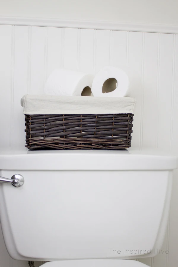
I've had that little basket for a long time. It happened to be the perfect size for the back of the toilet, so I repurposed it to hold extra toilet paper.
Wanna know something kind of silly? That little plant is my favorite part of the bathroom! I ordered it online expecting it to be bigger, and when it was arrived it was just so tiny and cute! It ended up being the perfect simple accessory for the countertop.
I am just so thrilled with how it all came together! The new shower, the beadboard, the vanity, the lighter wall color... it all just works together so well to make our teeny tiny bathroom feel like a bigger, more luxurious space! I also love that it finally blends with the simple modern farmhouse style in the rest of our home.
So, let's see how we did!
Bathroom Makeover To Do List:
Remove tile backsplashRemove countertop and vanityInstall beadboardInstall new vanity and sink faucetRemove glass shower doorRemove shower tile and old cement boardInstall PROVA BOARD PLUS+Install new subway tile and groutRemove tile wall moldingsInstall and paint wooden floor moldings/trimUpdate floor grout colorPaint walls- Update light fixture
Accessorize
The only thing we didn't do is update the light fixture. I had planned on at least changing out the shades, but the further along the project came, the better the original looked. By the end, I didn't hate it anymore and thought it worked pretty well with the rest of the accessories. Otherwise, we tackled everything on our to do list in just six weeks! Another One Room Challenge success (see our kitchen challenge here)!!!
Decor Sources:
- Shower tile
- Grout
- Shower drain
- Shower curtain rod
- Shower curtain hooks
- Shower curtain
- Bath mat
- Toilet paper holder
- Botanical prints
- Vanity
- Sink faucet
- Faux plant
- Hand towel
- Wall color- Sherwin Williams "Natural Choice"
- Beadboard and mirror color- Sherwin Williams "Alabaster"
If you're looking for more room makeover inspiration, stop by Calling It Home to see the rest of the One Room Challenge reveals. There are so many amazing rooms by such talented bloggers!!!
Big thanks to our sponsors! Stay tuned for tutorials on PROVA Board Plus+ installation and shower tile installation next week!


WOW! What a transformation! You two totally knocked it out of the park!!!
ReplyDeletesuch a great difference! i love the beadboard wall treatment!
ReplyDeleteYAY YAY YAY! All your hard work paid off! The new tile is so beautiful and it definitely works with the old floor tile. Also, I love your new vanity! Good job, friend!
ReplyDeleteGreat job, it looks amazing!
ReplyDeletesuch a huge difference!! You guys really transformed this space, love it!
ReplyDeleteLovely! Big fan of your sink cabinet. Super pretty style and finish!
ReplyDeleteThat vanity is gorgeous and I love the new wall color!
ReplyDeleteIt looks beautiful Nicole! Love the tiled shower and the decor is perfect!
ReplyDeleteIt looks so amazing Nicole!! I can't believe how much brighter it is in there. And the tile in the shower is SO much better!!!! :)
ReplyDeleteIt looks fantastic, Nicole! Such a huge improvement.
ReplyDeleteGoing all the way up to the ceiling with the tiles and removing the door really did make the space look so much bigger!
ReplyDeleteBeautiful update on this bathroom. The shower looks gorgeous! I love your new vanity, and that little plant :) Isn't funny how something so simple can become our favorite thing? Great job in here!
ReplyDeleteWay to go! It looks amazing!
ReplyDeleteIt looks so beautiful! You did such an amazing job!
ReplyDeleteHooray - it looks awesome! The subway tile is just perfect, and you were able to bring all the colors together so well. Beautiful job!
ReplyDelete