Before photos and mood board for a 1990s kitchen getting a 1920s makeover
I've been waiting for this day for so long y'all! The fall One Room Challenge hosted by Calling It Home and Better Homes & Gardens is here and I could not be more excited! We moved into our 90-something-year-old farmhouse a little over a year ago and have been striving to preserve and restore some of its old farmhouse charm while adding a little of our own flare, but we haven't shown the kitchen any love yet. It's the main hub of our home where we spend lots of time, but it doesn't quite feel like "us" and certainly lacks vintage charm. I'm so excited to show what we have in store for it!
I am honored to be collaborating with Sherwin-Williams and Kingston Brass on this project. As always, I only promote brands that I love and think you will too.
This post contains affiliate links for your convenience. For more information, see my disclosure policy.
This post contains affiliate links for your convenience. For more information, see my disclosure policy.
You might also love...
The main part of our house was built about 90 years ago. (Side story- we were told it was built in 1930 but we've been doing some hard core house history hunting and found that date is wrong and it was built earlier, we're just not sure exactly when quite yet. Stay tuned for more on that saga later!!!).
We've had so much fun discovering things about our home's history and finding all of the intricate little details that are left from way back when.
However, the kitchen side of the house was an addition in the 1990s. I actually found the blue prints for the addition, and it turns out they tore down an old closed in porch and rebuilt it as a two story addition including the kitchen, laundry room, two bathrooms, and the master bedroom.
The man who lived here in the 90s was a general contractor and skilled wood worker, so he did add plenty of beautiful custom details on this side of the house. But in general, other than the industrial light fixtures that the previous owner added, the kitchen feels very builder grade and it lacks the old house charm that the rest of the house has.
My goal is to refresh the kitchen with that old house charm and make it blend seamlessly with the rest of the house.
Ready for some photos of the current state of things?
Before
At first glance, the kitchen doesn't look so bad. In fact, plenty of people have told us how cute it is! But I promise, up close, it looks its age! 😳 We both cringe a little when someone tells us they like our kitchen! 😂
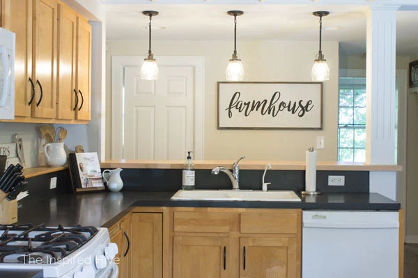
Here you can see the industrial pendant lights installed by the previous owner. They're stylish and we do like them, but they just don't fit the period of the home or the style we are going for. We'll be giving the pendants a fun little makeover.
That pocket door leads to the laundry room and the window on the right is the powder room which also has a pocket door. I would love to replace the doors with antiques but am having trouble finding any that will fit the pocket door track, so in the mean time, I plan to paint them.
How cool is that ceiling? The ceilings in our house are 7 to 7.5 feet. On the "new" side of the house, they kept the ceiling height consistent with the old part, but they left the joists exposed in the kitchen which makes it feel higher in here. It also adds a little bit of that old house feeling we are looking for.
See that sink? I love that its a white porcelain enameled cast iron sink (see my tutorial on how to deep clean white farmhouse sinks!), but that faucet has got to go. It's awful. It's plastic. The sprayer has a mind of its own. And it has almost no water flow. Washing dishes is a nightmare!! Not to mention it's just very basic in style.
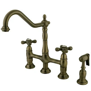
I'm so excited to upgrade it with this beauty from Kingston Brass!
Meet the Heritage bridge faucet. Isn't she gorgeous? I think the bridge detail paired with that brushed Vintage Brass finish will add tons of vintage charm to this space and be a focal point in the room.
The biggest change for this kitchen will be updating those cabinets! I know they look "fine" in photos, but they are water damaged, covered in grease, and show 30 years of wear and tear.
I will be painting the lower cabinets green (my favorite of course!) and the uppers white. I'm replacing the hardware with antique brass cup pulls and antique porcelain knobs. I'm so excited to bring some antique finishes into this space!
We plan on keeping the white appliances. I honestly hated trying to keep our stainless steel free of toddler finger prints in our old house. And I think white appliances tend to add an old feel anyway.
Have you seen the Smeg line of white vintage style refrigerators? White is back in style, y'all! Embrace it!
We also plan to add a v-groove backsplash along the countertop and behind the fridge. We'll remove the cabinetry to the left of the microwave and install open shelving. The v-groove will match the v-groove in other places in the house, and the open shelving will make the space feel bigger and more open.
That little ledge on the back of the counter will get painted. Do you see the weird protrusion on the wall to the left of the microwave? That is a radiant heat pipe coming out of the boiler on the other side of the wall and heading upstairs for our baseboard heat. It can't be moved, so I'm going to wrap it in a faux wood beam.
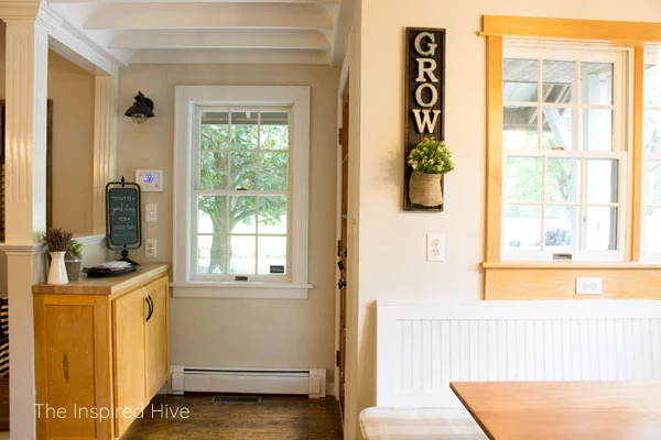
This is our breakfast nook. We hardly use our dining room and eat most of our meals here.
That table was left by the previous owner. It's not very sturdy which has been dangerous with our two toddlers. It's also really hard to get in and out of the bench with those table legs, so I've been working on a custom built table with a single farmhouse style leg that will allow us to slide in more easily. I'm sharing that tutorial with you next week!
That light fixture matches the pendants and will be swapped out for a large schoolhouse pendant to fit the time period of the house.
Those windows are the only ones in the whole house that have wood trim, so they'll be painted white to match the rest.
Our back door is tucked in this corner. It serves as the main entrance to the house. Even the mail person comes to this door! It's a drop zone for us of course, so I'll be looking for a way to make it a little more functional without looking cluttered when we drop our keys, mail, shoes, etc.
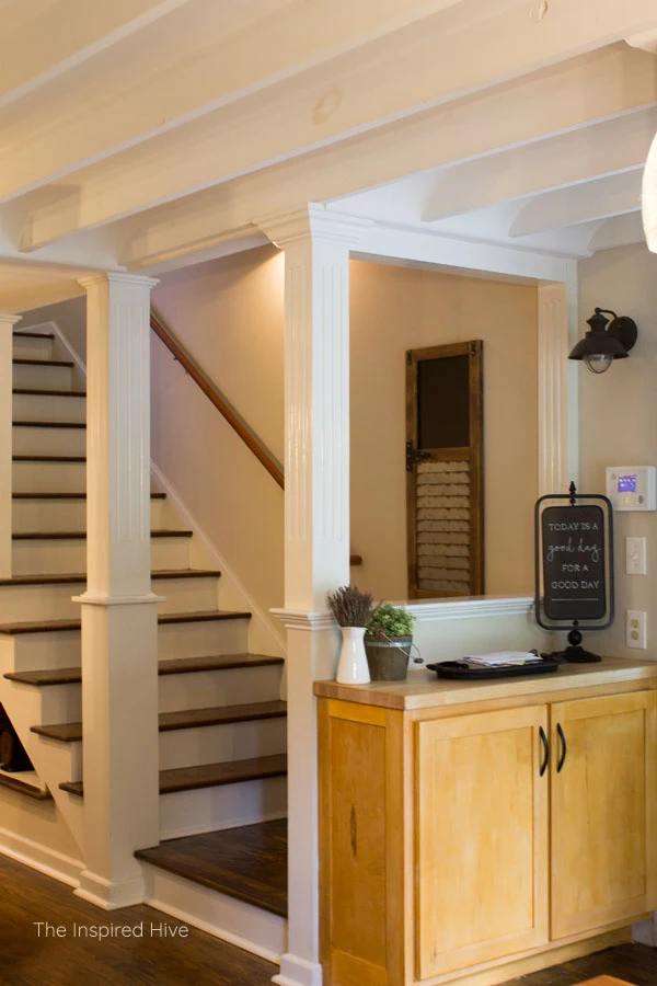
This is one of two sets of stairs in our house. These go directly to the master bedroom. I'm not a huge fan of those pillars and hope to give them a little love at some point, but I'm not sure it will happen on the ORC timeline. We'll see!
In our old house, I had the cutest little coffee bar! We are big coffee drinkers, so we miss that coffee bar of course!
In this kitchen, there is an awkward little nook under the stairs that currently holds our coffee essentials. I'll be brightening it up and making it more functional with white cabinetry, a back splash, and some hooks for mugs.
Now that you've seen what the kitchen looks like, let's take a look at my inspiration board for this room!
1920s Vintage Kitchen Design Plan
Paint- In the 1920s, kitchen and bathrooms were mostly black and white because there was a fear of germs and they thought white was cleaner. When the 1930s rolled around, color started to make more of an appearance, and that's when those bright mint green kitchens and bathrooms came into play. Since our home sits somewhere around the turn of the decade, we are embracing a little of both styles, although a little more subdued than the bold mint! The lower cabinets will be Sherwin-Williams Privilege Green and the upper cabinets, walls, and backsplash will all be Sherwin-Williams Incredible White. The doors and a few other accents will be Sherwin-Williams Greenblack, a lighter black with a hint of green.
Backsplash- We ordered this v-groove plank kit. It's thin enough (5/16") to not sit too far off of the backsplash but will still blend well with the true one inch thick v-groove planks we have in other areas of the house. We will cut it down to size and paint it.
Lighting- The lighting seen here is from Elk lighting that I found when I started planning this space. However, I actually found a beautiful true antique milk glass schoolhouse shade on Ebay (search for one here). I bought a fixture with the proper sized fitter for it from Lamp Goods, but they also carry it as one product including the shade.
Peg rail- Peg rails are another vintage detail we have in other areas of our home. We plan on building our own mug rack to fit our nook using wooden pegs, but you can also buy ready made racks in standard sizes.
Appliances- That range is in the photo to show that we will have white appliances. We are keeping our current appliances because white is pretty timeless. But if you're on the hunt for white appliances and love the vintage style, take a look at the Smeg refrigerators and the Hallman ranges.
Chairs- I love the vintage feel of Thonet style replicas. These Vienna chairs from Crate and Barrel will be perfect for our breakfast nook and add some contrast to the space.
Faucet- The Victorian style Heritage Kitchen Bridge Faucet from Kingston Brass is absolutely gorgeous and will add so much charm to this room. The Vintage Brass finish is stunning and I can't wait to show it to you! The sprayer is also made of real brass. If the vintage brass finish isn't your thing, this beauty also comes in several other finishes!
Sink- We plan on keeping our original Kohler white porcelain enameled cast iron sink, but if you're in the market for one, this one is very similar.
Hardware- I plan to replace the cabinet hardware with antique white porcelain knobs. I found the cutest ones on Ebay at a steal of a price! (Search here for knobs if you're interested!). I'm still searching for the perfect vintage brass cup pulls to match our brass faucet. The ones featured here are from D. Lawless Hardware but I'm not quite sure if they are the winners yet.
Rug- I would like to add some texture to the room with a rug by the door and by the sink. I have purchased this rug for something else in this past and think it would be perfect here, but it's currently sold out! I'm keeping an eye out for something similar!
The mug- What's with the mug in this design plan? We received a set of Sophie Conran's Carnivale dishes in "Celadon" as a wedding gift and they are my favorite thing ever! They don't make the white/celadon combo anymore, but I've been adding plain white and plain celadon pieces to my collection over the years. The celadon coloring is a light green/blue shade and shares partial credit for inspiring my paint color choice. I think the green lower cabinets are going to help these dishes pop! I can't wait to display them on our new open shelves!
I would love to hear your thoughts on our plan! Here's the entire to do list in a condensed version. I'll add this list to each post over the next six weeks and check things off as we go. Thanks for following along!
Be sure to follow my Pinterest board in collaboration with Kingston Brass to see all of the inspiration I find for this space throughout the process!
Our kitchen makeover to do list
- Paint the walls
- Paint the cabinets
- Install new cabinet hardware
- Install a painted v-groove backsplash
- Paint countertop shelf/ledge
- Remove glass cabinet
- Add open shelving for Sophie Conran dish collection
- Wrap radiant water pipe enclosure with faux wood beam
- Build new table for breakfast nook
- Buy new chairs for breakfast nook
- Install new light fixture above table
- Update pendant lights above bar
- Install new vintage inspired faucet
- Buy new bar stools
- Paint the doors and update door hardware
- Create coffee nook with peg rail mug rack
- Find artwork and wall decor
- Change all electrical outlets and light switches to white (or black on the countertop)
Big thanks to our One Room Challenge sponsors!
Stop by the One Room Challenge blog to see everyone else's project plans!

Related Posts:
Modern Farmhouse kitchen makeover


I can’t wait to see the finished project! Those ceilings are amazing, and all the ‘30’s detailing!!! So much character!
ReplyDeleteThank you so much! I'm excited to bring back some 30's charm!
DeleteHow original! A 1920s kitchen will be fabulous! I love the color combo and am anxious to see all of your 1920s touches. This kitchen will rock... Can't wait to see. ~~ Susie from The Chelsea Project
ReplyDeleteThank you so much! I'm hoping it blends well with the old side of the house!
DeleteThose are going to be some GREAT updates!! I love those colors!
ReplyDeleteThank you! I'm excited about the green :)
DeleteI love that green! Your plans are great! Can't wait to see how it turns out!
ReplyDeleteThank you! I think I'm most excited about that green!!! :)
DeleteI love your plan for your kitchen! The faucet is GORGEOUS and I cannot wait to see it. I'll be following along.
ReplyDeleteLibbie @lifeunfolding
Isn't that faucet stunning? I'm SO excited to install it. Thanks for following along :)
DeleteLove what you have planned here. YOu have some charming architecture to work with !!
ReplyDeleteThank you! Aren't the ceilings so cool? :)
Deletethat green is going to be so lovely!
ReplyDeleteThank you so much!
DeleteLove your inspiration for this space! Cannot wait to see it when it's done!!
ReplyDeleteThank you! :)
DeleteAh! so excited to follow along with this!
ReplyDeleteThank you, friend! I am more excited about YOUR space!!! Ahhhh! :)
DeleteThe "bones" of the kitchen are great - that ceiling is amazing. Love the inspiration, especially the colors!
ReplyDeleteThanks, Sarah! You're right, it has good bones and I am thankful for that! Hoping I can give it a little more charm :)
DeleteYour plan is so good! I look forward to seeing this project unfold. You've got such a cute room to work with.
ReplyDeleteStacy
BlakeHillHouse.com
Thank you so much! :)
DeleteI love that green color that you chose! It's going to look amazing.
ReplyDeleteThank you! I'm loving the color!!
DeleteHi fellow kitchen renovator! That faucet!! I love all the historic details you’re bringing in. Good luck!
ReplyDeleteThank you! I'm so excited! Good luck with your kitchen! :)
DeleteLove all of the charming details you have planned out for your kitchen!
ReplyDeleteThank you so much :) I'm thrilled to bring back some charm!
Delete