A 1990s kitchen gets a makeover combining traditional 1920s style and modern farmhouse decor
Six weeks ago we began our kitchen adventure with a goal of making our 1990s builder grade kitchen blend seamlessly with the rest of our 90 year old farmhouse. Six weeks goes by fast, and I can't believe it's already time to show you what we've been working on. In an effort to honor the time period of our home, we updated our kitchen with timeless and classic accessories with a touch of vintage style. But "old" doesn't have to mean "dated" so you'll also see a friendly nod towards today's modern farmhouse trends.
I am honored to be collaborating with Sherwin-Williams, D. Lawless Hardware, and Kingston Brass on this project. As always, I only promote brands that I love and think you will too.
This post contains affiliate links for your convenience. For more information, see my disclosure policy.
This post contains affiliate links for your convenience. For more information, see my disclosure policy.
You might also love...
- Vintage inspired kitchen design plan
- How to deep clean a white kitchen sink
- 10 Vintage style kitchens
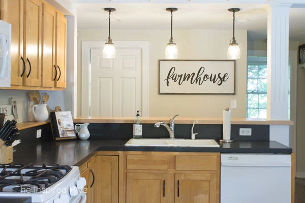
BEFORE- Builder grade kitchen
Let's start with a little refresher on where our kitchen was before. If you would like to see more details, you can see the entire before in week one.
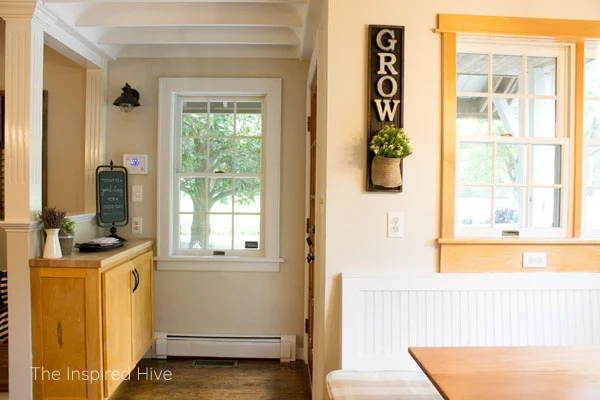
Our kitchen was very... orange? The pictures don't even truly do it justice. When we moved in, the floors were the exact same color as the cabinets. We had them refinished almost immediately because they were in bad shape, and the golden stain just isn't our thing.
It certainly had some cool architectural details like the exposed ceiling and the fluted columns, but overall it didn't flow well with the rest of the house. This old farmhouse is 90 years old, and this kitchen was an addition almost 30 years ago.
In an effort to make it feel a little more charming, I threw some modern farmhouse decor on the walls and loved it as much as I could until my amazing, super supportive husband said "let's do the kitchen for the ORC." I thought he had gone crazy 😂 but he was obviously speaking my language so I started daydreaming right away.
Now, I'm already forgetting how orange it was. Now it feels like us. It feels cozy and welcoming. It feels like home.
Modern traditional farmhouse kitchen
Today I want to invite you over for breakfast. Come on in, grab a cup of coffee, and hang around for a little tour of our "new" vintage inspired farmhouse kitchen.
Let's start with my new favorite corner of the kitchen. The breakfast nook.
This little spot sums up how I want our entire home to feel. Light and bright. Cozy and inviting. Aged but not outdated. A little farmhouse charm. A little touch of my favorite color. 😍
The table we had before wasn't really functional for our family, so we built this custom sized farmhouse table a few weeks ago. Find the tutorial here.
Over the past few weeks, I've shared a little bit about kitchen style during the time period our home was built. One of the elements you might find in a 1920s home is schoolhouse lighting.
I found this authentic milkglass early 1900s schoolhouse shade on Ebay for $15!!! I had a custom fitter made for it by Lamp Goods. I love the contrast of the black fixture against the exposed ceiling.
I really wanted to find some antique walnut Thonet chairs, but I had trouble finding a set for sale in driving distance. Luckily, there are plenty of replicas in production today to help pull my vision together.
The botanical prints on the wall are blackberries that were painted in the early 1900s. I chose blackberries because it reminds me of the excitement we had in our first full summer in this house this year. We found so much fruit growing on the property that we didn't know about when we bought the house... or for the first nine months that we lived here! Blackberries were one of the first things we found. They also happen to be my husband's favorite.
I love the gentle pop of green that these throw pillows add to an otherwise neutral corner of the room. They help tie everything together with the rest of the room.
To the right of the table is the main part of our kitchen. This is by far the biggest transformation in the room. No more orange. 🙌
This old house has low ceilings... seven to seven and half feet. They kept the ceiling height the same on the "new" side of the house when they did the addition. I wanted to visually raise the ceiling and make the space feel bigger, so everything from the countertop ledge up to the ceiling got a coat of Sherwin-Williams "Incredible White." It's not quite a true white. It's more of a very light greige when compared to a bright white. It adds a touch of warmth to the space.
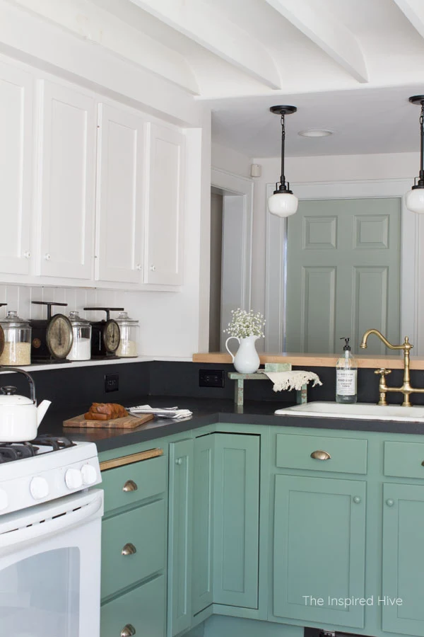
For the walls I used Sherwin-Williams Emerald Interior paint. It goes on nice and smooth and has great washability which is important in a heavily used room like a kitchen (or if you have two toddlers 😉 ). On the cabinetry, I used Sherwin-Williams Emerald Urethane Trim Enamel. I highly recommend using a self leveling enamel when painting cabinets to avoid brush strokes and to ensure durability. I'll do an updated post on my cabinet painting method soon!
I'm pretty sure all my friends and family thought I was crazy when I told them I wanted to put antique porcelain knobs on my cabinets. But just look at these cuties!!!
One of the only original doors remaining in this house has a little latch on it that has a small porcelain knob on it. When I was repainting that room, I kept finding myself staring at that little knob, wondering how it old it really was and how many people had walked through that door. I knew I wanted to add this historical charm to our kitchen too.
I've always dreamed of a white kitchen, but after painting the kitchen cabinets in our last house Agreeable Gray which most people thought was white anyway, I was craving a little color. Sherwin-Williams "Privilege Green" on the lower cabinetry adds personality to the room, is a modern take on a historically correct color scheme, and just so happens to be one of my favorite colors.
Those vintage brass cup pulls are from D. Lawless Hardware (a great place for affordable hardware of all kinds!). I love the contrast of the brass against the green.
Originally I planned to put the porcelain knobs on the lower cabinets as well, but they were a little too distracting to the eye. Instead, I purchased some wooden knobs and painted them Privilege Green.
To add more early 1900s charm, we installed a v-groove backsplash. We have true tongue in groove in other areas of the house, so it seemed like a no brainer. We chose a lightweight, thin version and painted it in the same enamel as the upper cabinets.
To help open up this small kitchen, we removed the glass cabinet on the end in order to add open shelving. This exposed a major eyesore. Our radiant heat pipe going to the second floor was enclosed in drywall behind the shelves. To help it blend in, I wrapped it in a faux wood beam.
I love how the open shelves turned out. I have a collection of Sophie Conran dishes that I love. I never thought I would be able to keep open shelves clean and tidy, but having something I love on display is motivating enough. I especially love having our everyday plates and bowls in easy reach.
I love them so much that after removing one cabinet, I wanted to take down all of them! But we ran into an electrical related problem that would have seriously impacted our deadline... so maybe another time :)
The vintage prints seen here are all also late 1800s or early 1900s artwork adding more "old" charm to our kitchen. The black eyed susans are the state flower where we live, and they grow abundantly in our yard. I chose the bird print for two reasons- 1) Our yard is full of sassafras trees. They are absolutely beautiful, but they are invasive here in Maryland and we will likely be removing sassafras saplings for the rest of our lives 😉 2) This painting was done by John Audobon. I spent half of my childhood in Lousiana, where Audobon did much of his studying of birds. As a kid, we went to the Audobon zoo and the Audobon plantation, both places I love.
To the right, sits a collection of vintage kitchen scales. I painted the shelf white to blend it into the backsplash, but I wanted to fill it with decorative pieces to keep it from becoming a clutter landing zone. Adding storage canisters and scales worked out perfectly. One of the scales I bought at a local vintage market a few years ago and the other two I bought on Etsy (my friend Katie often sells scales in her shop!)
I hope to find solid wood early 20th century doors to replace our pocket doors with. But for now, the hollow core doors got a coat of Sherwin-Williams "Contented" which is on the same swatch as "Privilege Green." The subtle color doesn't take away from the dark green cabinets.
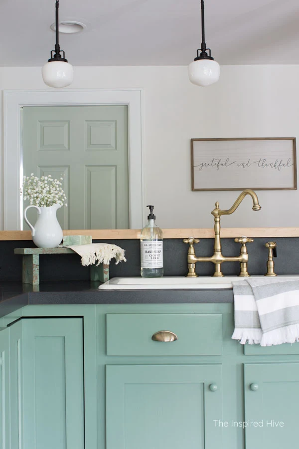
The pendant lights were installed by the previous homeowner, and they were cute and stylish, but the industrial vibe didn't really fit my vision. I gave them a budget friendly update with black spray paint and mini schoolhouse shades.
Another new favorite part of the kitchen is the vintage brass Heritage bridge faucet from Kingston Brass. 😍😍😍
Our old faucet was made out of plastic and had a mind of its own. And there was definitely not anything charming about it 😉 But this stunning beauty and its matching sprayer add so much style and instantly transformed the feel of the kitchen. It's heavy duty, made of real brass, so its built to last, just like this old house. Seeing the aged brass finish against the black countertops and the green cabinets makes my little decor loving heart smile.
On the other side of the bar, I bought new barstools with similar lines as the Thonet style chairs.
I painted the back of the cubby under the stairs Sherwin-Williams "Greenblack" a few months ago. I am constantly rearranging this area trying to find the perfect balance of useful storage, decorative, and toddler friendly items.
Above the cubby are the spice racks I made several years ago. They are still one of my favorite DIYs to date.
Just around the corner, is a nook under the stairs. It's kind of an awkward area. The ceiling is really low and the wall in front of it is an odd shape. I decided to use the nook as a coffee bar and create a collage on the wall above to fill the otherwise unusable space.
I'm not entirely satisfied with the items on the wall quite yet. Finding the perfect antique goodies takes time. But for now, the space is filled and adds more of the wood and black found in the rest of the kitchen.
We added the same v-groove backsplash to the coffee nook along with a DIY shaker style peg rail. These peg rails were common in the early 1900s and we have two others in our home.
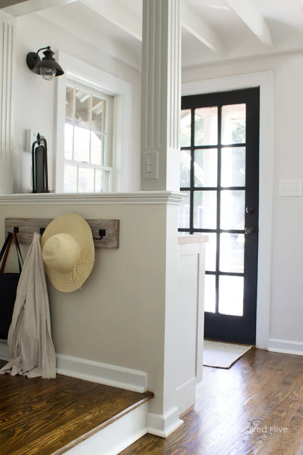
Turning back towards the rest of the kitchen, you see our back door. This is the main entry to the house for us. Our cars are right outside this door. And even the mail person comes to this back door.
Inevitably, it has become a drop zone. I created this little coat rack with wire hooks a few months ago. It usually holds my boys' jackets and the diaper bag.
On the other side is a cabinet that I also painted "Incredible White." This countertop is often covered in mail, so I found this wooden letter organizer as a solution.
There is still a lot I would love to do to this kitchen, because as a chronic DIYer, the wheels in my head never stop turning 😉 But for now, I am so excited to have a kitchen that we love and that honors the time period of our home a little better. I am so glad I listened to this old house when she nudged me to let go of my old style and embrace her age. She's lead me to a very classic design that will stand the test of time. Embracing historic charm doesn't have to mean feeling like you actually live in the 1920s. I've found the perfect combination of "old" and modern styles to create a cozy relaxed home to raise our family in.
See something you love? You can find the sources for everything in this space here:
- Wall color- Sherwin-Williams "Incredible White" in Emerald Interior Acrylic Latex
- Upper cabinet color- Sherwin-Williams "Incredible White" in Emerald Urethane Trim Enamel
- Lower cabinet color- Sherwin-Williams "Privilege Green" in Emerald Urethane Trim Enamel
- French door and under stair nook color- Sherwin-Williams "Greenblack" in Emerald Interior Acrylic Latex
- Pocket door color- Sherwin-Williams "Contented" in ProClassic Waterborne Interior Acrylic Enamel
- White porcelain knobs- search for antiques on Ebay
- Wooden knobs (primed and painted in "Privilege Green")
- Brass cup pulls
- Backsplash (painted "Incredible White")
- Corbels (painted "Incredible White")
- Vintage prints (freebie printables coming soon!)
- Faux beam in "Puritan Pine" (I ordered from Architectural Depot but had a pretty bad experience. Home Depot also carries this brand of faux beams)
- Enamel tea kettle
- Breakfast nook table (DIY tutorial)
- Chairs
- Napkins
- Sage green pillow case
- Botanical pillow case
- Striped pillow case
- Light fixture (this fixture without the shade + antique schoolhouse shade from Ebay
- Green rug (2'x3')
- Mail sorter
- Vintage brass faucet
- Thankful sign
- Pendant lights (This pendant spray painted black + these mini schoolhouse shades)
- Bar stools
- Mug rack
For more kitchen inspiration, follow my vintage farmhouse kitchen board on Pinterest!
Our kitchen makeover to do list
Paint the walls✔Paint the cabinets✔Install new cabinet hardware✔Install a painted v-groove backsplash✔Paint countertop shelf/ledge✔Remove glass cabinet✔Add open shelving for Sophie Conran dish collection✔Wrap radiant water pipe enclosure with faux wood beam✔Build new table for breakfast nook✔Buy new chairs for breakfast nook✔Install new light fixture above table✔Update pendant lights above bar✔Install new vintage inspired faucet✔- Replace RO filtration faucet
Buy new bar stools✔Paint the doors and update door hardware✔Create coffee nook with peg rail mug rack✔Find artwork and wall decor✔Change all electrical outlets and light switches to white (or black on the countertop)✔
Big thanks to our One Room Challenge sponsors!
Stop by the One Room Challenge blog to see everyone else's project plans!
Pin it for later!











You get the prize for best vintage kitchen. LOVE the color combos and the brass faucet set! Swoon. This is a major accomplishment. Congrats to the moon and back! ~~ Susie from The Chelsea Project
ReplyDeleteOh my goodness you are so sweet! Thank you! I am really happy with how it turned out!
DeleteOh my goodness Nicole! It's absolutely gorgeous! I LOVE that you found a way to update everything and really let the beautiful character of your home shine through! It's absolutely perfect my friend!
ReplyDeleteThank you so much, Kristi!! It really feels so much like the rest of our home now! I am always amazed by the difference a little paint and a few fixtures can make.
DeleteSuch a beautiful kitchen. So many lovely moments. I am a huge fan of a banquet and that little section of open shelving perfectly suits your charming farmhouse!
ReplyDeleteThank you so much!!! We love the banquet too. It's the perfect spot for our little family.
DeleteYour kitchen is stunning, friend! Love how it’s updated but definitely vintage with all the white, the schoolhouse lights, and all the other beautiful decor and details!
ReplyDeleteKendra | www.joyinourhome.com
Thank you, Kendra!! It feels fresh and updated but now has the character that the rest of this old house does :)
DeleteIt is GORGEOUS!!!!! You put so much work into this, and it came out like a professional kitchen renovation! I just love it and want to come have breakfast at your adorable table. I am so happy for you, Nicole! You have such a beautiful space to enjoy with your boys. Well done!
ReplyDeleteThank you so much, Bre!!! I'm excited to make memories in this kitchen and let the kiddos add some more distressing to that table ;)
DeleteEverything is so perfect! The paint color in the cabinets, the hardware, the open shelves...it all looks amazing! Great job!!
ReplyDeleteThank you so much!!! I'm so happy with how it all came together!
DeleteI love the colors that you chose! It's so much better than it was! It has so much character too!
ReplyDeleteThank you so much Jess! It's feeling a lot more charming like the rest of the house!
DeleteYour new kitchen is gorgeous! I love the cabinet color so much!!
ReplyDeleteThank you! I am loving the green so much!
DeleteI love that you did a sympathetic renovation, rather than just going for in the newest in thing! It is very pretty and workable too.
ReplyDeleteThank you so much! I wanted to combine old and new to honor the time period that our home was built without worrying so much about what is currently in style!
DeleteYour kitchen is totally gorgeous and a huge improvement over the old cabinet color. You did a wonderful job, and my favorite part is the little table nook.
ReplyDeleteThanks Nicki!! I think that's my favorite corner of the room! :)
DeleteIt's so pretty! What a wonderful transformation. I love the colors that you chose too.
ReplyDeleteThank you Stacy! The green makes me so happy :)
DeleteGreat job!!! Love the colors and that eating nook! How wonderful to have this space in the center of your home!
ReplyDeleteThank you so much! It's such a cozy and welcoming space now
DeleteBeautiful and creative!
ReplyDelete