A 100 year old dining room combining traditional, farmhouse, and modern details
I can't tell you how excited I am for this day! It's dining room reveal day, and to say I'm happy with how it turned out is an understatement. Our dining room is right in the center of our 100 year old farmhouse, so every person who enters our home has to walk through it. The main entry leads to the dining room, and then from the dining room you can either go to the living room or the kitchen. It is the main hub of our home and sets the stage for everything else in our house!
This post is sponsored by Minted. This post contains affiliate links for your convenience. For more information, see my disclosure policy.
You might also love... - Beautiful landscape art options
- Spring farmhouse style dining room
- Vintage inspired kitchen makeover
BEFORE
Here's some reminders of what it looked like before (pardon the fall decor! We moved here with a newborn, so I was a little preoccupied and didn't really take any house photos until the holidays!)This was the state of things when we first moved in. Beige walls. Natural pine floors. A pretty, but too tiny, hammered brass pendant light. And the furniture from our previous home.
Not bad. But not great either. Once we were feeling mostly settled in our new home, we refinished the pine floors and stained them a darker color.
To brighten things up, I swapped out the black dining chairs for a light white washed wooden chair. Then, thinking I would continue with the "modern farmhouse" style I had been going for in our previous home, I purchased a beautiful black and wood style chandelier.
It all looked very pretty, but something about it didn't feel quite right.
I've talked a lot on my Instagram account about my journey to redefine my style. This house is 100 years old and I realized that I wanted to complement all of its character and charm, not distract from it.
So I started bringing in antique pieces to complement all of those old details and make the place feel its age.
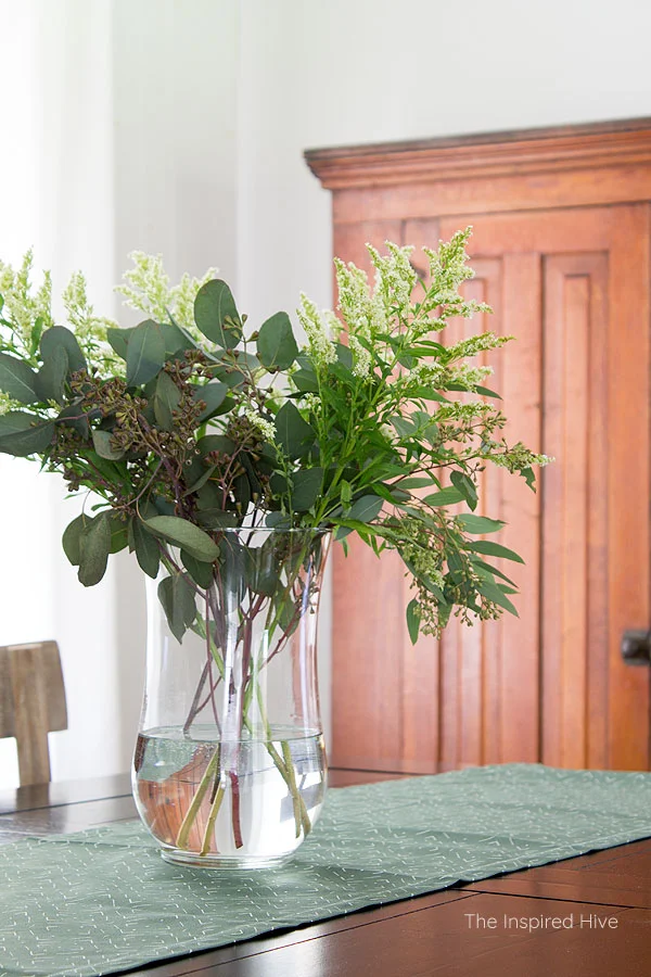
Enter this beautiful cabinet. 😍 I bought it from a couple who retired here to a nearby beach town and brought this originally-built-in upper kitchen cabinet with them from their 100 year old house because they just couldn't part with it. It unfortunately didn't fit in their beach cottage so they had to sell. Can you believe I paid $75 for this gigantic piece of history?!
And there the room sat. The cabinet was the right move, but I still felt unsettled with the space. I gave the room a fresh coat of paint to brighten it up and then left it alone for a while and worked on finding my style direction in other spaces.
I'm glad I waited. Because I figured out my vision. And I love where it's heading!
The traditional + modern + farmhouse dining room reveal
As I was doing some style soul searching, I landed on "modern traditional." Emily Henderson has a great series on the basics of this style.
I knew I wanted to honor the time period of our home with traditional pieces. I also wanted a little bit of authentic farmhouse charm since this was a true farmhouse. But I also realized that when I layer in too much vintage, I don't love it. And neither does my husband. We both crave a little tiny bit of modern and minimal. Modern traditional is the perfect fit. Ready?
Ahhhhh! I'm in love. Honestly, it turned out better than I envisioned.
To solve that problem, we installed a vertical "v-groove" tongue and groove wall. We have vertical tongue and groove in several other areas of the house, so it seemed a fitting addition that would help the room flow better.
With such a large feature wall, I wanted to bring in some large scale art. I really wanted a landscape to bring in a touch of nature and all of my favorite shades of green.
I chose "Broken Clouds" from Minted. I picked a sleek black frame to add that touch of modern I wanted. I love how it pops against the white tongue and groove!
I rounded up some of my other favorite landscape options a few weeks ago if you're looking for some!
Choosing lighting was the hardest part.
Truth be told, I first ordered a midcentury modern light fixture and knew as soon as I took it out of the box that it wasn't right. But I wanted to like it, so I sat it on the table for several days to see how it looked and to think on it. Nope. I sent it back.
As I looked for inspiration, I kept coming back to photos that had pendant style lights with large metal downshades. I was torn since we had a pendant initially but got rid of it because we could hardly see!
I decided to go with my gut and ordered this stunning pendant. I went with a much larger sized shade than what we had before and adjusted the length to be closer to the ceiling so that it would cast light on the entire table. Much better!
I love how it adds a touch of modern but still has a utilitarian farmhouse vibe.
Did you notice that runner on the table? 😍 So much goodness! You know I need my pop of green in every room!
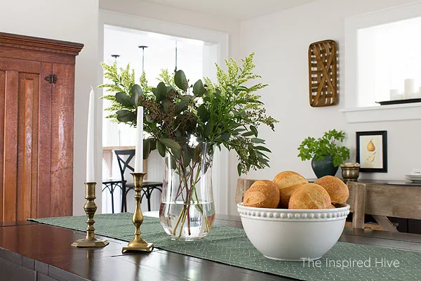
This "Compass Dash" runner from Minted in the color "palm" is the perfect green with a hint of blue. It breaks up that heavy-feeling black table and adds a fun flair with a modern pattern.
The white design pops under the white pendant light. And just look at how well the color complements the antique cabinet! 😍
(PS- if you're looking for table linens, they have countless options that fit any style and color palette!)
I do want to replace those chairs. I love them but I have my heart set on some vintage Thonet bentwood chairs that I can paint. The cabinet brings in a lot of wood, so I feel that painted chairs would be a better fit. However, I have to have patience in finding vintage chairs!
From the back corner of the room, you can see the kitchen doorway and the awkwardly placed window to the mudroom/main entry. This has been a problem space for me to decorate, but I think I'm finally heading in the right direction.
The buffet table from our previous home sits under the window. I removed the lower wine rack and filled it with vintage books (glass bottles at toddler level just wasn't working out 😂). We built two wooden storage trays to keep table linens in and again break up all of the black in this dark room.
I hung tobacco baskets on the sides of the window to help it feel more balanced.
My favorite part of this little spot is probably this planter. It was a shiny silver vase that I had been holding onto for far too long because it might come in handy some day. It was part of my modern glam phase of 2010! Well, I gave it a makeover with some spray paint and it became the perfect detail in this modern traditional room. The color goes so well with the Minted table runner.
That little vintage brass bowl is filled with wine corks from our favorite Maryland wineries. I try to add meaningful details to every room. I believe that home should tell a story.
In the other direction, you can see a glimpse of the living room. It's a much brighter space so this was a little tricky for me to photograph, but you get the idea. That room is still a work in progress, but you can see the antique secretary desk and modern art that tie in the whole modern + traditional theme.
And can we just drool over that landscape art one more time?! 😍 I really think it helps pull the whole room together so well!!!
I'm just so ecstatic about how this whole room turned out. Beyond being a finished space that I can check off my to do list, it represents the monumental moment that I "found" my style. I have direction and a vision for the entire house now. This room has given me a peace that those who are equally obsessed with decorating will understand! We've lived here for almost two years now, and I finally feel like I can move forward in decorating. I felt stuck for so long! Nothing I thought I liked seemed to work here. I'm so excited to see how everything else unfolds. And thank you from the bottom of my heart for following along on this journey with me 💛
Decor sources
See something you love? I've linked to everything in this space below. If I couldn't find the exact item, I found a similar item.- Wall color- Sherwin-Williams "Incredible White"
- Large landscape art- Minted "Broken Clouds"
- Table runner- Minted "Compass Dash" in "palm"
- Light fixture
- Black farmhouse dining table
- Whitewashed bistro chairs
- White woven rug
- White curtains
- Black curtain rod
- White bowl
- Clear glass vase
- Antique brass candle holders
- Buffet table
- Painted vase color- Rustoleum "Hunt Club Green"
- Antique brass bowl (similar options)
- Vintage pear art (similar options)
- Tobacco baskets


I absolutely LOVE it Nicole! The tongue and groove walls bring just the right amount of texture, the pendant was a perfect choice and that gorgeous pine cabinet was made for your beautiful farmhouse! I've really enjoyed following along with your stories on Instagram and seeing how this all evolved.
ReplyDeleteThank you so much, Kristi! I am just tickled with how it all turned out! And thank you for following along- it has been quite the journey figuring out what I like in this old house. But I sure am enjoying it! :)
Delete