A budget friendly master bathroom update in modern traditional style
One of the first projects we tackled when we moved in was the master bathroom. The master suite was added on to the house in the 1990s, and then the previous owner removed a tub to put in a walk in shower, and changed the countertop, faucet, and mirror. Overall, the bathroom was a good size and not terrible, but it just wasn't our style. In our first house, the master bathroom was the very last room we updated and we barely had a chance to enjoy it before moving, so in this house we decided it was worth doing a quick budget friendly makeover to make it feel more "us." And now, we're on take two of that budget friendly makeover!
This post contains affiliate links for your convenience. For more information, see my disclosure policy.
You might also love... Before
Just as a reminder of where we started... 1990s vanity with recently updated countertop and brushed nickel faucet. And a rustic grey washed mirror. A cool grey paint on the walls. And a roller shade window treatment that fell on my head every time I tried to open it.Storage included built ins. The shower has a modern mosaic tile niche that I wish I could change, but it's fine for now.
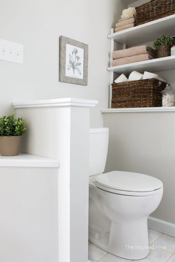
And let's not forget the little privacy wall next to the toilet that I can't wait to rip out someday. Complete with plastic beige toilet paper holder. Hello 1990s.
So our initial makeover was just to make it feel more "us" using things we already had. I warmed the space up with a warm grey paint on the walls. I used paint leftover from our previous house to update the vanity and added some hardware. We decided to work with the existing mirror and faucet at the time.
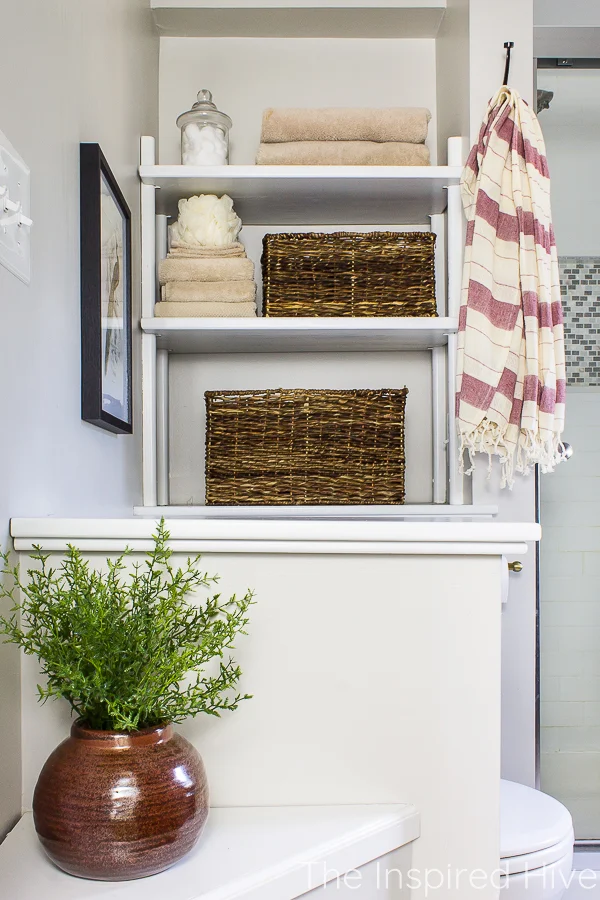
I also painted all of the wood on the built ins white. There are times when I am against painting wood. This was not one of those times. It brightened up the space so much and took us from the 90s to now. The toilet nook looked so much less awkward!
This all worked fine for a while. But then I started realizing that the farmhouse decor I used in our old house didn't quite fit in this house, and so as I learned what the house and I both could agree on, I started my transition to "modern traditional" style. It was time to revisit this space.
Our modern traditional bathroom design
Since we aren't quite ready for the full gut job on this bathroom, I stuck with another budget friendly update. A few small changes made a huge impact! This will definitely hold me over until we're ready for bigger changes.I left the walls and vanity alone, but I painted the door black to add some contrast. Not too long ago, I went through a phase of all neutral everything, but the more I learn about design, the more I crave contrast and a little color.
It was hard to get a good rug photo, but I added this runner in front of the vanity. It hides a lot of that blue/grey floor tile that I hate, and it adds warmth to the room with a mix or maroons, greens, creams, and blacks.
I attempted to paint the existing mirror, but it just made it worse... so I decided to bite the bullet and splurge on a mirror that I loved and knew I could use in the future when we eventually remove this vanity.
I let myself be brave with mixing metal finishes here. Normally, I would stick to two metal finishes, but I think three is justified in this space, and I'm actually really happy with how it turned out.
Really, it's all about balance. The vanity hardware works well with the dark door, but a dark mirror would have been too harsh here and I just loved this gold finish and balanced it out with that little brass bowl on the tray.
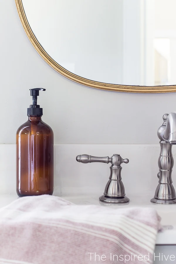
We swapped the faucet for a more vintage style faucet to flow with the rest of the house better, but I stuck with brushed nickel due to the shower surround and shower fixtures. No sense in changing all of that when we know we will be removing it in a few years.
Each finish is balanced throughout the room and I think it works well here.
Because switching from one large mirror to a smaller mirror over the sink created blank wall space, I needed something to fill that awkward space on the right. I debated putting some frames on the wall or some small floating shelves, but it felt too cluttered. I really enjoy simplicity.
So instead, I created a small tray vignette and used tall pampas grass to fill the wall space. The vase I picked up at Homegoods several months prior because I liked the texture, but it was black and white with a zebra feel to it, so I spray painted it with an olive green to pull greens from the rug.
I found the vintage brass bowl on Etsy. I love how it looks with the mirror. And the new faucet is way more my style than what was there before.
Since we knew we would be gutting this space eventually, we chose a very affordable faucet since we likely would not choose nickel in our dream bathroom (we would probably choose either brass or chrome because we try to choose finishes that would have been used at the time our house was built 100 years ago. They will always be classic in a house this age, even when they are "out" of style.)
Budget friendly tip for you... I buy handsoap in glass bottles from Homegoods. When the soap runs out, I remove the label and refill the bottle. So that soap dispenser cost me about five dollars two years ago and I just refill it with a bulk bottle of soap.
I chose a hand towel with some maroon in it to pull some of the reds from the rug. I usually stick to only green, but I've been trying to be a little braver with my color choices lately. I love that small touch of red!
Overall, this view feels a lot better! So much more "us" and flows with the rest of the house so much better!
The other side of the room just needed some small changes. I hung new art- a modern black frame with a vintage peacock print that has the same colors as the rug.
And I finally installed a new toilet paper holder! We had been living without one since I took down the beige plastic one two years ago. This vintage brass one balances the brass on the other side of the room, and looks so pretty!
I still need to buy new bath towels... the beige ones are fine, but they're pretty old. I just haven't decided if I want a neutral or a color. I'm thinking either an ivory or an olive green.
This rust colored vase again balances out the reds from the rugs and hand towel. And it was only $10!
For an affordable room refresh, I am feeling so good about how this all turned out. It just goes to show that you don't need a ton of money to create home sweet home! If I hadn't ended up changing the mirror, I would have spent less than $200 on this whole room refresh!
Sources
- Wall color- SW Agreeable Grey
- Vanity color- SW Mindful Grey
- Door color- SW Greenblack
- Mirror
- Faucet
- Rug
- Vanity hardware
- Hand towel
- Soap dispenser (Homegoods) - similar ones
- Wooden tray
- Vintage brass bowl - similar options
- Glass apothecary jar - similar
- Pampas grass
- Turkish towel
- Toilet paper holder
- Black picture frame
- Peacock art
- Vase
- Baskets (Michaels)


No comments
Post a Comment