A baby girl's nursery with dusty pink and green accents and traditional style
When we found out we were having another baby, I had a feeling it was a girl. It's the first time I've ever had a true instinct on gender. I kept that notion to myself, but I let the daydreaming begin. I had the whole nursery already planned out in my head and on Pinterest, because I just knew in my gut, that we would need a sweet, girly space soon. I truly love being a boy mom, but I had soooo much fun designing this room and am so thrilled with how it all came together. I can't wait to snuggle her in the rocker any day now!
This post contains affiliate links for your convenience. Product for this post was provided by The Futon Shop. For more information, see my disclosure policy.
You might also love...
- Vintage train themed boy's room makeover
- 11 Must have items for your newborn baby
- DIY Gender reveal confetti poppers
Before
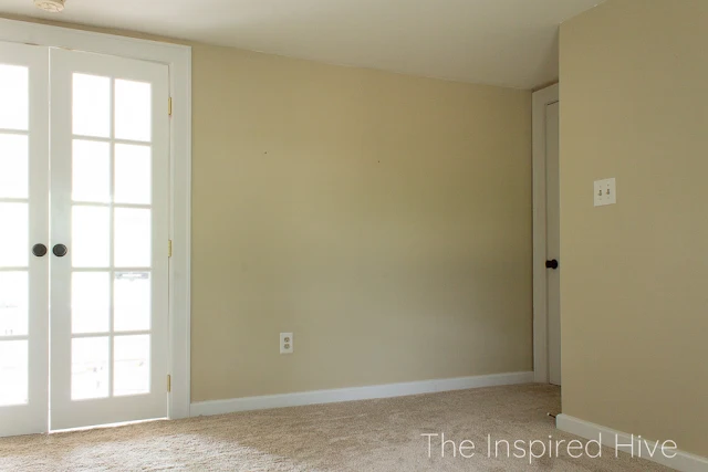
Let's take a look at what it looked like before. Dark and boring! This is the view looking in from the office, which is between the nursery and master bedroom.To the right of that window in the picture above is this corner which includes built in shelving that was in pretty rough shape.
The built ins enclose the old brick chimney, which we would love to expose, but our shower is on the side of the shelving, so there is no way to do it. Plus we would lose the closet, and we all know old houses don't have much storage!
Standing back by the window, you can see the French doors to the office, and the main door to the hallway on the right.
Also note the carpet. We were hoping to remove it and expose the original 100 year old floors, but when we started removing the carpet, we realized the floor was covered in lead paint. A project better left for when I'm not pregnant, and when the kids are out of the lead paint dangerous age group.
Overall, the room has good bones, it just needed to be brightened up and given some character.
Classic girl's nursery
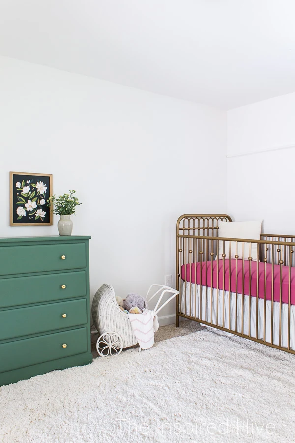
Okay, ready to see the completed space?? Ahhh, I'm so in love with how girly and classic it turned out! And this small, dark room now feels bright and beautiful!Let's start with the crib! I was originally hoping to find a light colored Jenny Lind style wooden crib, but I could only find dark cherry wood or black or white painted ones.
Then I saw my friend Diana's vintage nursery and fell in love with her gold metal crib. I searched for a similar one and landed on the Monarch Hill Ivy crib. It gives the room a vintage feel and looks classic and timeless.
We've been really happy with the mattress from The Futon Shop for my son's recent train themed room makeover, so we decided to see if they had any crib options. And they do! All of their products are organic, non-toxic, and American made, and they come at an affordable price! I love knowing that my kids are enjoying healthy sleep.
The Futon Shop kindly sent me their Sweetpea crib mattress. I chose this particular mattress because it can be used more long term. It has an extra firm coconut fiber side for the newborn phase, and a softer natural Dunlop side for the toddler years. The whole thing is wrapped in wool and then tucked into a cozy organic cotton cover.
They also sent me their organic cotton waterproof mattress protector. It zips over the entire mattress making it a nice snug, worry-free fit.
Although my inspiration for the room was this magnolia print full of lots of green and black, I still wanted to add some girly pink! I wanted a dusty rose color and landed on this fitted crib sheet from Caden Lane. (It's super soft by the way!) I love how the rose color pops against that gold!
The Futon Shop was also so sweet to send us a beautiful NatureSoft chenille baby blanket for our little girl. It is a medium weight blanket with a velvety texture. The size is big enough that it can grow with her into the toddler years. It's so cozy that I'm tempted to bring it into the living room for snuggling on the sofa when she arrives!
I debated whether to use a crib skirt this time around. With both of our sons I chose a really nice crib skirt that matched their bedding, and I have to admit, it was not worth the cost because once they start moving and you lower the mattress height, the skirt can't be used because it is all bunched up on the floor. I thought a skirt would look very elegant for a girl's nursery though, so I chose one that is plain, simple, and very affordable.
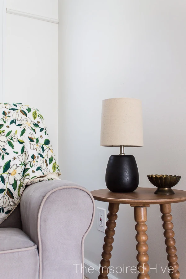
I really really wanted a new glider for this space. We still had the grey one from our first son's nursery and used it for both boys. But I didn't really love the grey for this room and the chair itself didn't feel like a very feminine design. However, it's still in really great shape and I couldn't find anything of equal quality at a price I could justify when I had a perfectly good chair. And so here it sits!
And surprisingly, with a few girly accessories, it's really not so bad. And it's kind of special that I can say I nursed all of my babies in this chair. Maybe I need to keep it forever for sentimental value 😂
That beautiful magnolia print quilt is from the same collection as the art that inspired the room. It's a soft muslin quilt, and I love it! The colors in it gave me a reason to move this round velvet pillow into this room. I bought it for the living room, but it feels right in this room instead!
Something I always wish I had in our boys' nurseries was a table next to the chair. I never had anywhere to set my cup of coffee, phone, or whatever book I was reading. So it was a must have this time!
I found this super affordable spindle table that is the perfect size and adds a wood tone and vintage feel to this corner of the room. I love this little mini lamp I found that gives it that touch of "modern traditional" that I love.
Remember the not-so-pretty built in shelving? I'm in love with it now! We installed v-groove planks along the back and sides, and then painted everything green. They look SO much better now!!!
I didn't want to overdo the magnolia theme, so I chose some other girly artwork for the shelves. Ballet slippers and swans were the perfect fit. I kept everything a little antique, but minimal for a modern feel.
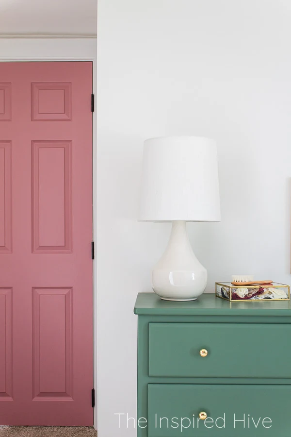
I've mentioned over and over that eventually we will replace all of the doors in the house with antiques or at least an antique style. In the meantime, I have slowly been painting all of the hollow core doors in the house. It's a simple way to add a pop of color and interest to each room.
For this room, I chose Sherwin-Williams Pressed Flower which is a little bit lighter than the dusty rose sheets, but very similar. I had some antique glass knobs that a woman gave to me when I bought some antique furniture last year, and I've been hanging onto them in case we had a girl. They look so pretty on the pink doors!
I think this might be my favorite part of the whole room... the dresser turned out better than I could have imagined! It was mine as a kid, and then my mom used it for a while. (I actually painted it for her in my early blogging days and it is still somehow one of my most popular blog posts!)
We sanded it down and I painted it with Sherwin Williams "Basil," which I chose by holding up swatches to the magnolia print. I installed raw brass knobs that will patina over time. I love how the brass pops against that green!
I'm so in love with the magnolia print. I spent half of my childhood in Louisiana. The state flower there is the magnolia. Somehow here in Maryland, both houses my husband and I have owned have had a Southern Magnolia tree in the yard. They seem to follow me and feel special to me, so when I saw this print, I knew it was perfect for our little girl.
That glass box on the dresser holds headbands and bows (just some of them! I've already accumulated so many!!!)
I was looking for a large scale lamp for the dresser, and overall felt like the room was starting to pull a little too "antique," so I hoped to find something slightly modern. I think this lamp adds the perfect touch of modern and minimal and changed the whole feel of the room.
My mom found that cute antique stroller for me. It's perfect to use as a basket for stuffed animals for now. Someday I'm sure it will be filled with baby dolls, and I can't wait for that!
I almost forgot about the trim along the back wall! I felt like that wall really needed something but there was already a lot going on in the rest of the room, so I didn't think art was the solution. Since our house is 100 years old, I thought it would be pretty to add a faux picture rail. The way I'm using it isn't exactly historically accurate, but I believe in a little creative freedom. We chose a trim that has a pretty detailing carved into it. I think it adds the perfect, simple accent to that wall.
Sources
- Walls- SW Alabaster
- Doors- SW Pressed Flower
- Dresser and built in shelves- SW Basil
- Crib
- Sweetpea mattress
- Mattress protector
- Rose fitted sheet
- Crib skirt
- NatureSoft baby blanket
- Faux picture rail trim
- Grey glider
- Magnolia quilt
- Velvet pillow
- Large round basket
- Spindle side table
- Small black lamp
- Small storage basket
- Ballet slipper art print
- Swan art print
- Brass carousel horse
- Large cylindrical vase
- Large white lamp
- Glass display box
- Magnolia print
- Wooden picture frame
- Rug


It turned out SO beautifully Nicole! I absolutely love that gorgeous crib and you worked those pops of colour in so perfectly!
ReplyDelete