Variations of modern traditional living rooms
We're into week two of the One Room Challenge, and I'm already saying "what was
I thinking?!" 😂 The ORC with three kids is a totally different ball game! We've
done some painting, but nothing that makes a noticeable difference on camera
yet, so I don't have much progress to show you this week. Instead, I thought it
would be fun to dive deeper into my plans for this space and where I got my
inspiration.
Thank you to Loloi Rugs for providing product for this project. This post
contains affiliate links for your convenience. As an Amazon Associate, I
earn from qualifying purchases. For more information, see my
disclosure policy.
You might also love...
My style
In last week's blog post, I discussed how I want our home to feel storied. It's 100+ years old. There was a brief time where I thought I wanted to modernize it.. but as I started researching its history and learning its story, I fell in love and instead wanted to honor its history and bring in lots of antique pieces. I went a little too far in the opposite direction at that point and felt like I was stuck in time. So through trial and error, I learned that I like a mix of eras and a careful balance of old and new.I want our house to feel like it has been through every design era since it was built and picked up a little here and there along the way. And now I am slowly revisiting each space in our home to bring that vision to life.
I'm also heavily inspired by very organic feeling spaces. I am very drawn to lots of texture, rough hewn wood, natural colors (not just neutrals, but earthy tones), and lots and lots of greenery (although I do not have a green thumb!).
So in summary, words I would use to describe my dream style are: organic, aged, collected, storied, classic, timeless, traditional, minimal.
Living Room Inspiration
Today I want to share with you some of the living rooms that inspire me. I am a very visual person and detail oriented. I can look at the same photo over and over and notice something different each time. The images below are photos that I have gone back to look at over and over during the past year or two.
They are all slightly different in style and I am drawn to different aspects of them. But if you could mush all of these together, you might have close to what I would call "my style" ...although I'm not sure I'm a believer in having a set personal style because it seems to be an ever evolving thing.
This first photo is from one of my absolute favorite interior designers. Heidi Caillier puts together beautiful storied spaces with lots of texture and pattern. She mixes and matches different eras, but I often get an 80s vibe from her. There are a lot of things I'm drawn to in this space, but particularly I love those wooden chairs (which I think are midcentury? I tried to ask Heidi about them, but she didn't respond 😂), the bold marble fireplace, and the mix of patterns on the upholstery, pillows, and lampshade. I am probably not quite brave enough for such a bold mix, but its definitely what I daydream about!
Today's trend of white walls and lots of clean lined furnishings and decor can result in a pristine and stuffy feeling sometimes. Notice that Heidi's design includes white walls, but this room still feels very warm and inviting. I feel like I could walk in and kick my shoes off instead of feeling like I'm not allowed to touch anything.
In contrast, the photo below is another favorite that I have looked at over and over again. It has a very different feel. It feels more classy and sophisticated, but still traditional. I love the millwork on the walls. I'm very drawn to the color choices on the sofa and throw pillows. The vignette styling on the furniture piece behind the sofa is totally something I would put together. And I even love the kind of modern European empire lampshade. This space was designed by Ginny Macdonald for Lulu & Georgia.
Let's look at a more organic space. I think I've pinned this image a hundred times over the years! This space is from the popular Amber Interiors. Her spaces feel very organic to me. I come back to this picture over and over because I love the color of the plant on the coffee table and the ottomans in the background. I find many people are so afraid of color these days, but look how pretty and subtle it is when it's a color found in nature! Nothing scary or overwhelming about it at all!
I am also drawn to the rustic coffee table and mantle, and the statement antique table in the back corner.
Over the past year, I've thrown the term "modern traditional" around a lot. But modern traditional has taken on so many variations in the design world. The space below is what I think of when I hear modern traditional.
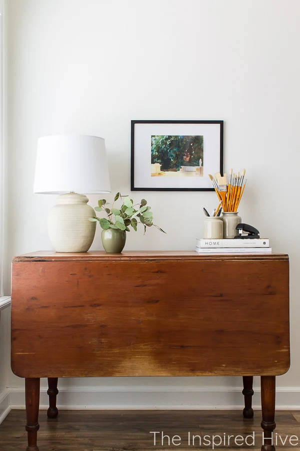
The millwork, shape of the sofa, the end table, the lamp, the art, are all very traditional, historic inspired elements. But they feel "modern" to me because the space is very minimal. Notice the large statement planter, the single piece of art, the side table with only a unique lamp on it. I'm very drawn to everything in this space. I'm not sure of the designer, but this photo is of Heckfield Place.
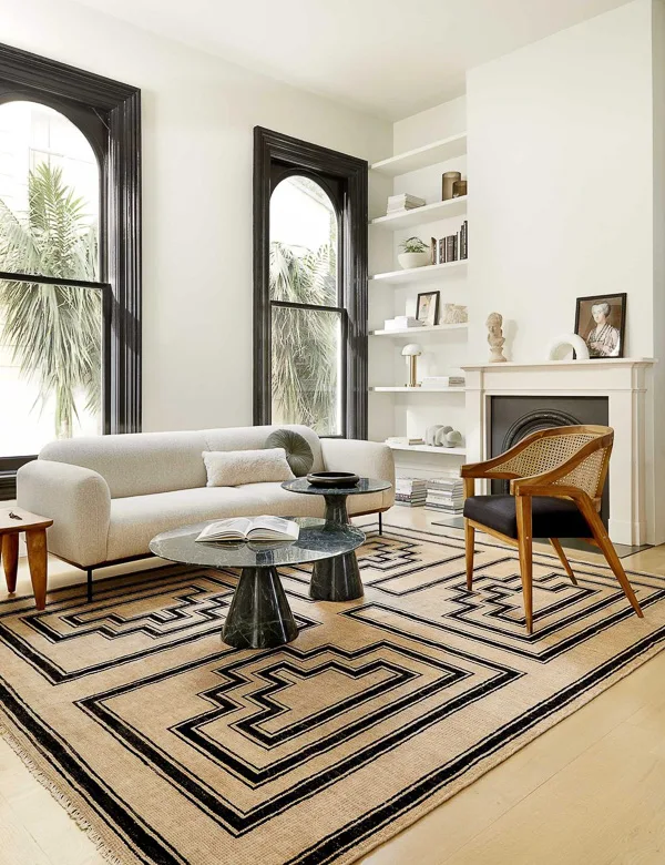
Okay, here's a curve ball for you. I also love Art Deco inspired spaces! This image is from Lulu & Georgia. I always love the mix of white and black, especially in a historic home. Black marble is a must. I love the sculptures in the background. And in small doses, the funky shapes of Art Deco are very interesting to me.
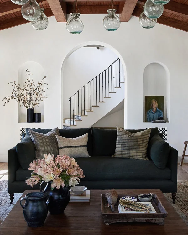
The photo below is another space by Amber Interiors. This is probably my dream sofa. I love that it's dark and clean lined but still feels timeless. I love those arches in the background with their minimal but big impact decor items. I'm not really into the light fixture or ceiling, but everything else is beautiful.
I love this space by Haus Love because it does a good job of mixing things I love. The fireplace commands the room to feel traditional and is accompanied by the antique end table and that piece in the back corner. The sofa and textiles have a more earthy feel to me. And the gallery in the background feels modern because of the abstract pieces.
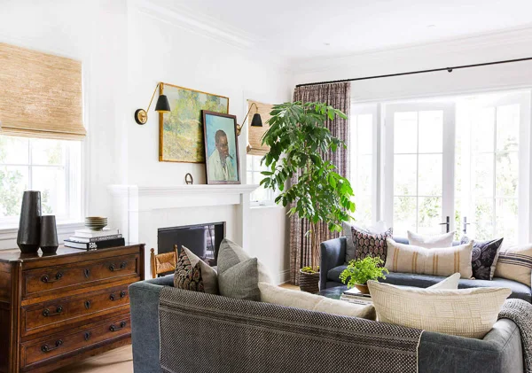
Okay, one last space from Amber Interiors. I knew I loved her, but I didn't realize just how much until I was putting together this post! In this photo, I am immediately drawn to that antique dresser. Many people hate this antique wood color, but keep in mind that your wood tones count as a color in your space. They can be a red, orange, or yellow to contrast with your greens or blues! Trends seem to lean towards very neutral wood tones that have almost no color to them. It's a beautiful look, but don't be afraid of adding a more rich wood tone too! It can have a very dramatic impact and add so much warmth to your space!
I am also drawn to the patterns and colors in the textiles here. This is a very colorful space without feeling overwhelming.
Have I confused you yet with this large mix of styles? 😂 Don't worry, I confuse myself too. But I fully believe it's okay to like lots of different styles and pull bits and pieces from them all. It's all about balance. And waiting for the right pieces instead of rushing into purchases. Good things take time!
My eclectic traditional design plan
I'm hoping I can pull all of these looks together to create a space that feels storied and timeless, sophisticated but cozy, and with a touch of earthy and organic, of course!Here are just some of the things I have collected for this room so far.
And here is my design plan that I shared last week. Hopefully you can now see where the inspiration for each of these elements came from. Do you spot a little Art Deco, Mid Century, and Post Modern? And let's not forget our Victorian staircase that will be the backdrop of this mix. Do you get an organic feel? A mix of patterns and earthy colors? Does it feel timeless and classic?
I hope that the finished product will do this moodboard justice!
Shop the look:
ORC Task List
We've made a little bit of progress painting the walls and built ins. We're hoping to really dive into things this weekend. Here's our entire task list for next several weeks.Paint the walls- Paint the trim
Paint the built ins- Change hardware on the built ins
- Paint the stairs
- Paint the balusters
- Paint French door
Remove surround sound wiring and patch walls- Paint the entertainment center
Buy new TVand mount it on the wall- Change feet on the sofa
- Paint coffee table
- Build end table
- Find and paint desk or cabinet below stairs/behind sofa
-
Purchase seating(I bought the chairs in my mood board, but one of them might not arrive on time!!) - Install sconces
- Layer new rug over old one
- Art and accessories
Don't forget to check out all of the other One Room Challenge spaces!
PS. If you're interested, here are a few great articles by the design queen Emily Henderson about some of the styles I showcased above.
Modern traditional
Modern Victorian
Art Deco
Post Modern


I also like that dark chest. It isn’t about color for me though, it is about patina. And the stripped down not refinished look is big now, usually in a lighter wood. The lack of shine gives it a less formal look.
ReplyDelete