A vintage schoolhouse themed playroom, perfect for the modern farmhouse home.
Have you ever walked into a room you completely overhauled that is finally complete and felt a big uncontrollable smile creep onto your face? You crossed the finish line. Your vision became a reality. There might have been a few hiccups, but what you planned out in your head, what you've spent so much time daydreaming about, what you've searched for endless inspiration for, all came together just right. That's how I feel at the end of every One Room Challenge. It's like a creative high that I just can't get enough of.
If you've been following along, we just took the farmhouse's original front porch turned sunroom and made it into a vintage modern schoolhouse themed playroom for our kiddos. We ran into plenty of unpredictable problems along the way, like with any old house room makeover. But we made it! In less than seven weeks!
If you've been following along, we just took the farmhouse's original front porch turned sunroom and made it into a vintage modern schoolhouse themed playroom for our kiddos. We ran into plenty of unpredictable problems along the way, like with any old house room makeover. But we made it! In less than seven weeks!
Big thanks to Blindster for sponsoring us in the One Room Challenge!
This post also contains affiliate links for your convenience. For more information, see my disclosure policy.
The chipped painted floor, the old ceiling tiles that were covering a lead painted porch, the zillions of unsafe things... it's all much better now.
To refresh your memory... here is what the room looked like before...
Okay, let's take a little tour. I don't even know where to start!!!
Keep in mind, that this is the farmhouse's original front porch. A previous homeowner later converted it into a sunporch (we assume in the 1970s-1980s based on the ceiling tiles and windows). So to get to it from our living room, you walk through what used to be an exterior door. You are then facing another, true exterior door. That door needed a little face lift, of course 😉 Here it is before...
And here it is after I attacked it with a little paint and Rub-n-buff 😍😍😍
I used Americana Decor's Satin Enamel paint in black. This paint is great for a kid space because it's tough. It also doesn't take a lot of prep work and is super affordable! 🙌
I used Antique Gold Rub-n-buff on the door hardware to match some of the other gold accents in the room and the gold hardware of the other door. I love how it truly looks antique with the original bronze finish showing through.
I added some simple black frames (less than $2!!!) with some pictures I took of our little guys. The black frames really pop next to that door!
And did you notice the heater covers?! I can't tell you how thrilled I am that we figured this out! The previous covers were old, rusty, and pulling away from the wall.
Since our toddler loves to stand on them, we wanted something a little safer. And prettier 😏 Well, since we recently learned how to use the easiest tool for building furniture, we thought it would probably work for this too. And it did!
So much better, right?! It did take a lot of research because you can't just throw some wood together and expect your heat to still be efficient.
So much better, right?! It did take a lot of research because you can't just throw some wood together and expect your heat to still be efficient.
We learned about the basic principles of how baseboard heating systems work and came up with a design based on what we learned. So far, the room is nice and cozy warm, so they seem to be working just fine! I will do a more thorough post on this soon for anyone who is interested in building your own.
Update 9/22/20- I get tons of questions about our baseboard heat cover and I am working on creating a post to answer them. Check back soon! :)
Okay, turning towards the right in the room, you can see that the baseboard heat extends to the end of the room, and it actually curves around to the right and into the far wall.
Okay, turning towards the right in the room, you can see that the baseboard heat extends to the end of the room, and it actually curves around to the right and into the far wall.
The other part of our wooden cover is hidden by the toy storage shelf we built. I was excited about this shelf when we finished building it, but now that I see it in the room, it's even more exciting.
We never really had a place to put toys before, so they were just everywhere all the time. I certainly don't expect this room to be tidy (because hello, it's a playroom, right?!), but it will be nice to be able to put them away at the end of the day, and to be able to start teaching the kids a little bit about helping clean up.
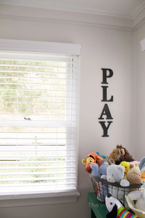
Above the shelf, I hung up some MDF letters that I spray painted black and spelled out the word PLAY. This room is meant to inspire imagination, creativity, and learning, and the best way to do any of that with kids is through play 😊
Above the shelf, I hung up some MDF letters that I spray painted black and spelled out the word PLAY. This room is meant to inspire imagination, creativity, and learning, and the best way to do any of that with kids is through play 😊
Also, check out those pretty blinds!! Such a huge difference from the cafe curtains that were there before. I know there are so many different styles and colors of blinds these days, but there's just something about nice, crisp, white blinds that instantly freshens up a space. They make the whole room look updated and modern.
The thing I love most about these blinds from Blindster.com is that they are cordless. No need to worry about the kids strangling themselves in long cords! These blinds easily raise up and down with the push of a button along the bottom of the blinds.
I also used the blinds as a way to disguise the old windows. There are seven windows in this tiny room, and they are placed close together.
Instead of placing a set of blinds on each window, I used one long set of blinds over each group of two or three windows to distract the eye from the individual windows and to make the windows feel bigger and brighter. There is one long valance across the top that ties this look together and makes the room feel more modern. Blindster can create cordless blinds up to 96" to help you achieve this look.
Well, shall we turn towards my favorite part of the room?? 😍
Ahhh! I'm so in love, y'all!
Let's talk about that flooring for a second.. I wanted something a little cooler, but when we had the pine floors in the rest of our house refinished, we realized we had to go with something a little more yellow so that it would flow better.
We found these gorgeous laminate planks for only $0.79/square foot! That means we covered this entire floor for less than $100. Pretty amazing.
Alright, back to the back right corner.. Hello again, pretty green toy shelf! Realistically, this shelf is going to covered in trucks 24/7. Our toddler loves to line all of his trucks up wherever he can.. table, bench, sofa, anywhere. He's going to be so excited to have a new surface to drive them on!
Alright, back to the back right corner.. Hello again, pretty green toy shelf! Realistically, this shelf is going to covered in trucks 24/7. Our toddler loves to line all of his trucks up wherever he can.. table, bench, sofa, anywhere. He's going to be so excited to have a new surface to drive them on!
That little strip of wall to the right was a tricky spot to deal with. The electrical panel lives there. We didn't want to nail shiplap into this wall with wiring behind it, so for now we opted to paint the existing beadboard. We have plans to figure out the shiplap situation soon. We hid the electrical panel with a large canvas so that the boys will never even know it was there. I attached the canvas with Command Strips to avoid nailing.
Let's not forget the cute rug made for driving too! We have trucks galore in this house, y'all. I searched far and wide for the perfect road rug, and chose this one. It's different than the one in my inspiration board, but it's better for driving and was a lot more affordable.
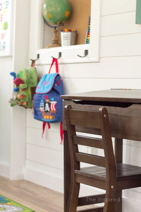
You might have noticed that built in shelf in one of my progress posts. For a while I was stumped with what to do with it. But then suddenly it dawned on me that a bulletin board would be perfect for a schoolhouse playroom. It would feel more like a real classroom!
I removed most of the shelving, only leaving one, which I painted black. I used adhesive bulletin roll meant to be used as a cabinet liner to cover the beadboard that was there before.
Our most recent Monthly DIY Challenge featured wooden beads, so I made a decorative abacus for this room. It turned out to be the perfect pop of color for this space! (Get the easy tutorial here!)
I also added these cute little hooks to hold backpacks. PS, isn't the pirate backpack adorable? A friend gave it to us as a gift when our first son was born, and I absolutely love it. I want to order one for our new little guy too. (This is the one we have, and you can also find many of them on Amazon)
I was so excited when I found these little desks! I had been on the hunt for some antique school desks on Craigslist, but I was having trouble finding a set of two similar ones.
Then, I stumbled across these on my favorite shopping site and knew they would be perfect. They are great size for little kids and have a large amount of storage for coloring books and other crafty items that are safe to be within their reach.
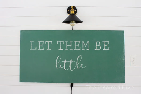
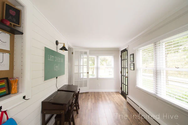
Don't they look so cute under our DIY chalkboard and against the shiplap wall?! 😍 I just love all of the contrast.
When my dreams of installing an overhead light fixture were crushed when we found the haint blue lead paint hiding in the ceiling, I had to come up with a new plan. Freestanding lamps were out of the question because the toddler is on a mission to destroy all the lamps!
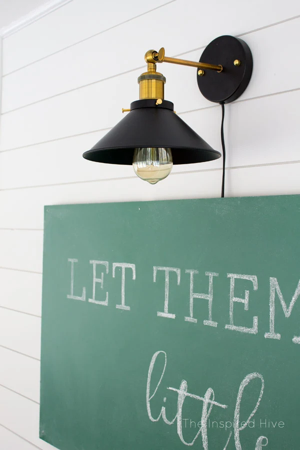
I opted for a plugin wall sconce instead. But this meant the cord would have to go under the chalkboard somehow to be able to plug in. So we decided to make it a floating chalkboard which I actually ended up loving more than I thought I would!
We made an extra Home Depot run to buy wood to make a frame, but then once we got the board on the wall, trashed that idea and decided just to make a chalk tray along the bottom. We even stained the pieces for the chalk tray. But while we waited for them to dry, I fell in love with this more simple, modern look, and we decided to leave it as is. I love how project plans evolve and change as you go! :)
I searched for the perfect "school" green for the chalkboard and ended up with Sherwin Williams Kendal Green. I covered a sheet of MDF with two coats and then used ModPodge's clear chalkboard coating before seasoning my board. Then, I used this easy text transfer method to add the chalk lettering.
The light is very different than my original plan, but I love how it looks with the chalkboard.
It adds just a touch of industrial to the room and gives it that modern farmhouse look that I love. Plus, it blends with the gold door hardware on both doors!
I'm truly so ecstatic with this whole space. I thought our kitchen makeover in our old house was my favorite room update ever, but I think this one tops that. It was such a huge transformation and is a space that is going to filled with so much fun and joy. I can't wait to watch our little boys play in here.
Huge thanks to our sponsor! Our playroom is a safe and beautiful place thanks to Blindster.com!
Don't forget to stop by Calling It Home to see the rest of the amazing One Room Challenge spaces! This is my favorite way to find new inspiration in never before seen rooms!!!

I searched for the perfect "school" green for the chalkboard and ended up with Sherwin Williams Kendal Green. I covered a sheet of MDF with two coats and then used ModPodge's clear chalkboard coating before seasoning my board. Then, I used this easy text transfer method to add the chalk lettering.
The light is very different than my original plan, but I love how it looks with the chalkboard.
It adds just a touch of industrial to the room and gives it that modern farmhouse look that I love. Plus, it blends with the gold door hardware on both doors!
I'm truly so ecstatic with this whole space. I thought our kitchen makeover in our old house was my favorite room update ever, but I think this one tops that. It was such a huge transformation and is a space that is going to filled with so much fun and joy. I can't wait to watch our little boys play in here.
Sources:
- Wall color- SW "Eider White"
- Blinds- Cordless Faux Wood in embossed white
- Door color- Americana Decor Satin Enamels in black
- Door hardware- Rub-n-buff in "Antique Gold"
- Flooring- Lakeshore Pecan
- Baseboard heat covers- DIY (tutorial coming soon)
- Black picture frames
- PLAY letters- MDF letters spray painted with Rustoleum
- Toy storage shelf- DIY tutorial
- Storage crates
- Canvas art- Homegoods
- Adhesive bulletin board roll
- Matte black hooks
- Backpack- Stephen Joseph
- Rug- LA Rugs "Countryfun"
- Desks- Lipper Schoolhouse Set
- Chalkboard- DIY with SW Kendal Green
- Industrial plug in wall sconce
Huge thanks to our sponsor! Our playroom is a safe and beautiful place thanks to Blindster.com!
Don't forget to stop by Calling It Home to see the rest of the amazing One Room Challenge spaces! This is my favorite way to find new inspiration in never before seen rooms!!!









Oh my gosh Nicole, it's absolutely perfect! What a fun little space for those boys to enjoy for years to come! LOVE every little detail!!!
ReplyDeleteThank you so much, Kristi!!! I love that it's a space that's perfect not just for right now, but also as they grow!
DeleteWow, such an incredible transformation! The plank wall paired with the chalkboard and school desks is simply perfect. And that dark door completely stole my heart.
ReplyDeleteThank you, Katie! The chalkboard is my favorite part, I think! :)
DeleteNicole... WOW!!!! I have a million things to comment on but I’ll try to limit it. 1. I love the whole room and it is such an amazing transformation. 2. Those floors are gorgeous- I can’t believe they were so cheap. 3. I want to know everything about those heat covers. They look so chic. 4. The black door makes such a difference. Great design choice. 5. Those tiny little book bags, I can’t!! So adorable. OK I limited it to 5 things �� I am obsessed though so I will be sharing this will my followers soon!
ReplyDeleteThank you, Marly! You are so sweet!! And aren't the little book bags so cute?! Even cuter when our toddler is wearing one! ;)
DeleteI love your little playroom, and I'm sure your kids do too! I love the schoolhouse feel, and all your little accents make the space just perfect. I'm totally going to use Rub N Buff now on my front door hardware. :)
ReplyDeleteThanks, Jenny! I've become addicted to using Rub n Buff!!!
DeleteI love how this turned out!! What a great space for your boys to play in...and I love that saying, let them be little!! Great job!!
ReplyDeleteThank you, Susanne!! The boys are loving it so far! The saying is from a great song! :)
DeleteThis is such a sweet space! Great job! I love the walls and the chalkboard. So cute!
ReplyDeleteThanks so much! The chalkboard is my favorite part!
DeleteDang, your kiddos are LUCKY! I love all the little pops of true colors-- nothing dulled down, just the kind of color that kids love! The little desks are so cute, and there's still lots of space for kids to be kids. Great job!
ReplyDeleteThanks so much! I'm normally very neutral in my decor, but kids love color!!! So I tried to balance it all to make colorful and neutral at the same time ;)
DeleteWhat an incredible transformation! It is such a fun space for the kids now.
ReplyDeleteThanks, Mary! They are loving it!
DeleteIt turned out so wonderfully, Nicole!!! So fresh and clean, yet perfect for little boys. I think those blinds are going to be so great in there. You're right about the cordless part being perfect for kids. Also, brilliant idea on the baseboard covers! They're really pretty and definitely nicer than the typical ones. Great job!
ReplyDeleteThanks, Bre! The blinds and heater covers totally freshened up the room and made it 1000x less worrisome with these crazy kiddos!
DeleteI love your ORC makeover-every little niche is great, but your sign and light is the sweetest little area. I've followed your blog for awhile now and I was happy to get to see your final look! Kristin @ Postbox Designs
ReplyDeleteHi Kristin! Thank you so much! That little area is my favorite part too! And thanks for following along :)
Delete